This selection is from the Oil Painting class at Norman Long Studio School
(click on images to see larger versions)
Debbie Heys
Artist: John Martin (1789-1854)
The Destruction of Sodom and Gomorrah 1852
84" x 54"

I was impressed by the sheer size, intensity of colour and
drama when I saw it at The Art Gallery
Manchester. The yellow, red and black
create an impression of heat from the
fire and the bolt of lightning seems to direct your attention to both the background
and foreground.
--------------
Kevin Johnson
Artist: Vincent Van Gogh
Self Portrait, 1887
41.0 x 33.5 cm.
Wadsworth Athenaeum Museum of Art, Hartford, Connecticut

This is my favourite picture by Van Gogh although I have
never seen the original which is in a museum in Conneticut. It is a small self
portrait - obviously Vincent is looking into a mirror. I like the picture
because his face seems to explode off the background and the face contains many
colours although they don’t show up on this copy of the picture in the print I
have on a book of Van Gogh there are a wider range of colours in the face.
Dave Walton
Artist: JMW Turner
Staffa, Fingal's Cave
1832

Much of Turners work seems to consist of wild turbulent skies and seas, which I enjoy. His paintings in his early years, from 1793 seemed to be quite detailed, but somewhat contrived scenes. Using many different mediums. Following his trip to Italy in 1821 he began to discover the effect of light and colour. This is probably what he is most famous for. In later years many of his paintings became very indistinct and loose in style leaving much to the viewers imagination, whilst striving to capture light.
-----------

Liz Eastham got rather carried away with Rembrandt, but that can be forgiven in my book.
Artist:Rembrandt
An Old Woman reading. 1655
(Isn’t she
beautiful? What a personality beneath that hood.)
Titus at his desk 1655.

(Such a beautiful boy!
Dreaming, you can see his imagination at work.)
I visited
the Rembrant Late Works exhibition at the National Gallery this week. It was
stunning and incredibly moving. I was in awe.
(It was
good not to be crushed and to have just the right amount of light and cool air
to enjoy being in each room. A well planned event.)
For me, I
gained a two things – Rembrandt’s powerful mastery of paint and brushstroke,
and his individual approach to his work. But I also felt something else,
something universal, a deep sense of our humanity and in particular the vunerability
of us all along life’s journey. The two
pictures above are looking at life from it joyous potential to its dignified end.

Portrait of a lady with a lap
dog.
It is this painting I looked at
closely. Colour attracts me immediately and the red fabric, tawny fur and
creamy skin tones against the dark background bring the lady closer to her
viewer. We engage with her, though she is looking to one side.
The composition is beautifully
balanced. While head and shoulders are centred, a pleasing diagonal line is
formed by the fur wrap on the left, down to the hand, the wrist, the sleeve and
the bottom edge of the fur on the right. But it is the almost vertical line
from the little lap dog’s head, up to the pearl drop and to the lady’s face
which gives the picture its strength. Our eye returns to the lady’s serene
face.
The soft flesh of the face, the
heavy lidded eyes, slightly uneven nose and a hint of jowls convey a thoughtful
woman rather than just a wealthy beauty of the day. Rembrandt used ashen
shadows against her pink mottled cheek to create both form and texture.
His loose, unfinished painting
of the dog and the fabric of the sleeve in the lower foreground serves to
enhace the head and shoulders of the lady which is finished in finer detail.
But it is the pearls I
studied closely, trying to dechipher his technique. Brightest spot, edged by
darkest curved line, plus reflected light, in repeated pattern...but what
colours had he used? It was a magnificent 3D illusion. To have recreated the
depth and weight, complexity and beauty of her pendant in paint...phew!
Janet Grierson
Artist: Francisco de Goya
Title: ‘Slices of Salmon’
Date: 1808
Dimensions: 17¾ x28⅜ inches

A humble subject is made dramatically important and real in a painterly, organic manner. In this spare image the neutral palette, and tonal difference between back and foreground, is punctured by vibrant, red salmon surfaces. Lights and darks interweave with reds and touches of blue-green; gentle diagonals off-set an implied horizontal horizon.
-------------
John McCloskey
Title: Maximus
Size: 60cm X 45cm
Medium: Oil on canvas

Artist: Carl Melegari
A combination of factors attract me to this work.
The way the artist almost sculpts the image onto the canvas with thick impasto, the almost monochromatic palette and the way the features of the figure, although not clearly defined, still evoke a strong response from the viewer.
For me, it speaks of resignation, of desperation and defeat but still retaining a sense of dignity and even nobility against the odds.
-----------
Susan Brown
Artist: Pietro Perugino
Virgin and Child with an angel
National Gallery

I don't think a reproduction will convince anyone of the stunning effect it had when I saw it close up many years ago. I think the purity of light and atmosphere around the figures was astonishing and it's the main memory of why it made such an impact. The subject is devotional so the angels don't look odd in this context -it's not meant to be realistic. The main figures are grouped firmly on the earth and are strongly linked by their gazes. The colours of garments are intense. The landscape is delicate and isn't too detailed with buildings or people to distract. I liked the gracefulness of the figures and remember the Virgin's hands especially. I saw it in Italy but I've only now seen that it's in the National Gallery. I'll have to go.
----------
Debra Siegal
Artist: Rose Frantzen
A portrait from the project "Portrait of Maquoketa"
Artist: Rose Frantzen
A portrait from the project "Portrait of Maquoketa"

In a year 2005-2006, Rose Frantzen painted 180 12" x12" 2hr portraits of anyone who turned up to sit for her. There is an inspiring youtube video where she discusses the project. I have selected this particular portrait from the project because I love the expression on the sitter's face. She looks like she's enjoying having her portrait painted. She looks animated, not just sat rigidly trying not to move. Frantzen seems really to capture the character of her sitters. Infact in the video she describes how they may sit and chat while she is painting, depending on the person, certainly looks like what was going on here. Her style for these quick portraits is quite loose and painterly and really amazingly finished considering the time scale.
Can I choose another....? Its just a little one -
Katy Schneider,
Living Room, 2000
8"x6"
Can I choose another....? Its just a little one -
Katy Schneider,
Living Room, 2000
8"x6"

I love the choice of subject matter, a scene from everyday family life. The three figures are all in the same room, not interacting with each other but busy doing their own thing. They also occupy different distances in space, creating a strong sense of depth. I like the use of colour, there are small shapes of red, blue, yellow and green, which are like colour accents against the neutral hues used in the rest of the painting. It also seems to capture a moment in time, as the child is about to leave the room.
--------
Jacqueline Hilton
Artist: Norman Garstin
"The Rain it Raineth Everyday"
95cm x 164cm
Artist: Norman Garstin
"The Rain it Raineth Everyday"
95cm x 164cm

Norman Garstin was a leading figure in the Newlyn School of painters and this painting is to be seen in the beautiful Penlee Gallery in Penzance.
I like it because of the wonderful way Garstin has captured the the opalescent quality of rain on the wet promenade .
Garstin is a master of the very subtle use of greys to create a feeling light and atmosphere
In situ at the above gallery, this painting, is a show stopper.
-----------
Ian Tidswell
Artist: George Clausen RA
"Spring morning on Haverstock Hill"
Bury Art Gallery
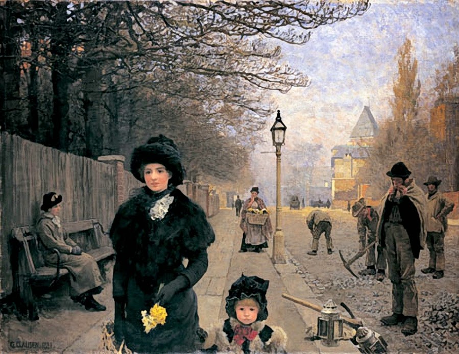
walking out of the canvas.
Brilliant painting and well worth the trip to see it.
-------------
Norman Long
Artist: Rembrandt
Portrait of and Elderly Man
1667
81.9 x 67.7cm

This is what I wrote in my sketchbook while stood in front of this painting in the Rembrandt Late Works show.
"Perhaps the greatest bit of direct painting I have ever seen. The ground colour (NOT burnt sienna but an opaque mix between b. sienna, raw umber and white) performs as neutral cools in the face and as very warm beneath the black in his vest. Here the marks are SO rapid, so sure, that the ground IS used, but not over-deliberately. The overall fuzzy evocation of the face sits next to slabs of flat black (hat) and white (collar). Here is the high point of what is possible working fast from life. You may never see this painting again, but remember it IS possible when you lose yourself like this."
No comments:
Post a Comment